
Coastal Home Title Logo
I was asked by Advantage Title Company’s Chief Strategy Officer to design the logo for their newest sister company: Coastal Home Title. My goal was to make an identifiable logo that drew reference from its name, while ensuring that it remain minimalistic and professional looking for its business function.


A B O U T T H E L O G O
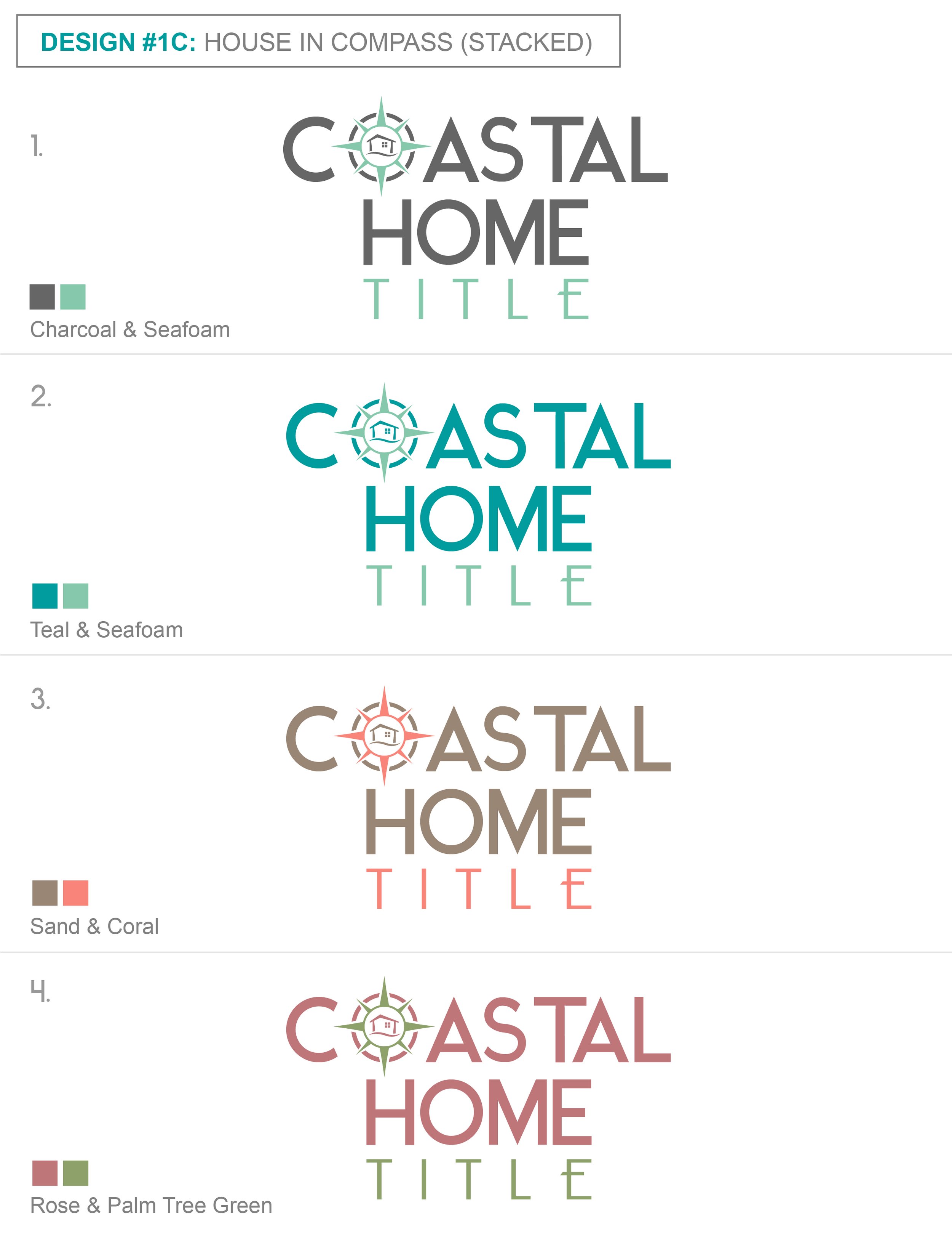
Coastal Home Title is located in Boca Raton, FL. This is the first of Advantage’s sister companies to be located in a tropical location. I knew I had to reference a nautical, “coastal,” element in the logo. The simplified compass design references the maritime element and also offers a nod to the sentiment that a compass helps point you in the right direction: it helps point you home (hence, the name of the business). I wanted the font to draw reference from Miami Beach’s Art Deco period of the 1920s-1940s. The placement of the compass to the left of the words creates a strong, horizontal design. For instances in which a “squarer” design is needed, I also designed a version of the logo in which the compass is faded in the background, with the words on top.
T Y P O G R A P H Y
When brainstorming the direction to take this logo, I was inspired by Miami Beach’s Art Deco architecture and color palette from the 1920s-1940s. I wanted the font choice to reflect this time period. For the word “Coastal,” I used the Ikaros Sans font, regular thickness, all caps. The low crossbar of the “A”, paired with the perfect circle of the “O’s” large counter area, strongly reference the art deco style.
For the words “Home Title,” I used the Optima font, regular thickness, all caps. With this font, I liked how the stems start wide and then, ever-so-slightly, become narrower in the middle, and then widen out again. I thought Optima paired nicely with Ikaros Sans because both fonts are on the wider side (as opposed to condensed). Additionally, although both fonts are sans serifs, Ikaros Sans gives a subtle nod to a serif font with the way its edges cut off - in a curved, inward direction. I wanted “Home Title” to center nicely under “Coastal,” so I increased the kerning to help the letters better fill the space (and to create a nice juxtaposition to the tightly kerned word above).

Final, Revised Logo
Initial “Final” Logo


C O L O R P A L E T T E
While I initially wanted the color palette to match the Art Deco inspired fonts, ultimately, the final logo did not pull from this color palette. With the initial “final” logo, I settled on a muted, seafoam green color (see logo to the top left). After the first few uses of this logo in real settings, it was clear that this seafoam color was too light against white backgrounds in small scales. It appeared washed out and un-readable.
So, I had to pivot and select a darker color that would stand out when placed on light backgrounds. I settled on a dark, navy blue. While this color doesn’t scream Art Deco, it still references the coastal, nautical, water element. Additionally, it pairs very nicely with the compass design.
While the color version of this logo shows up well on light backgrounds, it doesn’t stand out on dark ones. To combat this problem, I created an all-white version of the logo to be used on dark backgrounds.
F I N A L L O G O

P R O D U C T M O C K - U P S


P R E L I M I N A R Y L O G O S


I N I T I A L L O G O I D E A S - N O T U S E D


Program Used: Illustrator